We verify and update codes regularly—so you don’t need to compare elsewhere.Found an issue or a better deal❓ Tell us immediately and get a small reward ($5–$10). Your feedback helps us keep the best working deals.
Affiliate Disclosure As a reader-supported site, we’re dedicated to bringing you the best discounts. To keep improving our service, we may earn a small commission from product sales — at no extra cost to you.
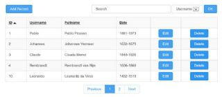
A grid based gallery which adapts to the screen size dynamically
The Masonry Gallery extension is a grid based gallery which adapts to the screen size dynamically. The gallery supports images with different sizes and aspect ratios. Basically, Masonry optimizes the use of space inside the web page by reducing any unnecessary gaps. This extension uses David DeSandro’s Masonry jQuery plug-in.
Masonry Gallery can be used in responsive layouts (with breakpoints) or inside a layout grid for full width/flexible layouts. Breakpoints can be added to adjust the column count for different screen sizes. Clicking on one of the images will trigger a lightbox slideshow. Another cool feature is the ability to control the position and size of the caption for each image individually. This make it possible to position each caption in a way that works best for each image.
Customer Reviews
Your comment is very important to us, be the first to leave one!
🔔 Are the Masonry Gallery promo codes on ColorMango legitimate?
All Masonry Gallery promo codes are obtained through official sources — including direct brand partnerships, verified newsletters, and manual verification by our editors. Every discount is carefully reviewed and tested by the ColorMango team to ensure authenticity and safety. 💡 You can use these promo codes with full confidence to enjoy official discounts.
🔔 How often are Masonry Gallery promo codes updated?
Over the past year, Masonry Gallery promo codes have been updated 0 times. The codes displayed on this page are the latest, verified, and highest discounts (user-reported invalid: 0 times), so you can use them with confidence. We continuously monitor official and partner channels and update the codes immediately when new promotions are found.
🔔 Did Masonry Gallery have any discounts during Black Friday/Cyber Monday?
There were no extra discounts for Masonry Gallery during Black Friday/Cyber Monday 2024. 🕵️♀️ ColorMango regularly monitors Masonry Gallery deals during Black Friday/Cyber Monday and updates the latest discounts as soon as they are available.
🔔 How to request a refund for Masonry Gallery?
Most software offers an unconditional refund guarantee within 7–30 days. You can check the official refund policy of the product, or contact ColorMango Support — we’ll assist you in completing the refund process smoothly.


